Appearance
Best practices for Power BI reports with DataScaphe Uplink
If you use the "Dataset Approach" for Scanner Metadata, also see: Scanner Metadata for required elements regarding the dataset.
Performance considerations
The DataScaphe Uplink web extension works by embedding your linked report in every web page that contains at least one of the values from the search terms (the report columns driving your analysis).
Then when the user hovers over one of the highlighted words, the report page and filters are changed to match the analyses for the given word.
So it is crucial to have the lightest possible report, with the fewest data and simplest measures.
A checklist of points to enforce:
- Only import the tables and columns that are necessary,
- Try to aggregate the data as much as possible,
- Filter the fact data to keep only the rows related to available dimension values,
- Try to keep measures simple, pre-calculate as much as possible in source data or during import.
There is no hard limit on the number of distinct values in the search terms, but try to keep it under 500k values to limit memory usage on the user's computer.
Design considerations
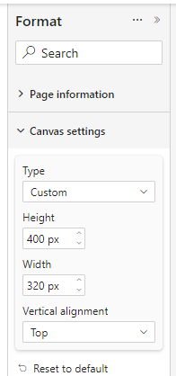
Page dimensions
The report page will be displayed with its dimension in pixels as specified in the Power BI report.
For best results, choose a page type of Tooltip or Custom and set its dimensions.
We recommend dimensions around 300px with a greater height than width.
Dimensions should be kept between 200px and 500px as smaller dimensions are harder to design for, and bigger ones may use too much space on your final web page.
During development, you can change the way the page is displayed in Power BI Desktop using the View > Page view feature:
- Fit to page or Fit to width makes the display bigger
- Actual size to display how it will actually look
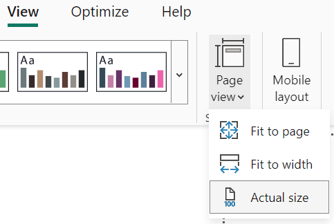
TIP
Remember to set it back to Fit to Page before publishing to the Power BI service, as other display modes can add scroll bars or additional margins in the embedded report.
Page name
Page names must be unique in the report.
Page organization
The available space is scarce in popups/tooltips and Power BI defaults are usually a bit too spacey to nicely fit.
We recommend keeping the number of visuals per page low (4-5 max), using visuals showing trends or aggregated numbers.
Regarding the design of visuals, the following points help with reclaiming/managing the available space:
- reduce padding,
- use smaller font size,
- remove most labels and legends, they can often be added as text boxes (dynamic or not),
- use themes to align colors on multiple visuals, in that case a legend can be displayed only on one of the visuals.
Custom visuals such as Deneb or HtmlContainer can also be used to achieve more compact designs.
Although the popup can temporarily be fixed in place (using the Keep current popup open option in the context menu), it is not designed to be interacted with, so try to avoid scroll bars and slicers or behavior relying on cross-filtering.